Colour Schemes For House Exteriors
These colours are popular choices for modern New Zealand houses:
Black-And-White Monochrome. The simple yet classic black-and-white monochrome look will never go out of style. Large blocks of blacks and whites can highlight architectural features. Contrasting shades will accentuate the shape of your home. Consider how you can use different amounts of black and white to enhance your home’s appearance – black with a white accent has a sleek, modern feel, whereas white with a black accent looks bright and spacious.
Blacks, whites and greys are safe choices for exterior paint colours because these hues go with every colour and architectural style. White and other lighter colours are popular choices for practical reasons – lighter colours reflect light, improving your home’s temperature regulation. Stark white may feel too harsh, so consider off-white colours or slightly darker shades to better suit your surroundings.
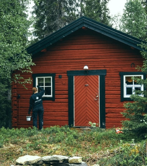
Vibrant Accent Colours. Pops of colour will add personalisation to your home. Exterior house painting is your opportunity to make your house more ‘you.’ Accent colours allow you to be adventurous with your house’s visuals; for instance, your front door can be a bolder colour than your exterior walls.
Your painters can use accent colours to emphasis parts of your home. Highlighting windows, front doors and railings will make your house’s appearance more dynamic. Using that accent colour on planters, garden furniture and decor throughout your outdoor space will add a harmonious effect to your property.
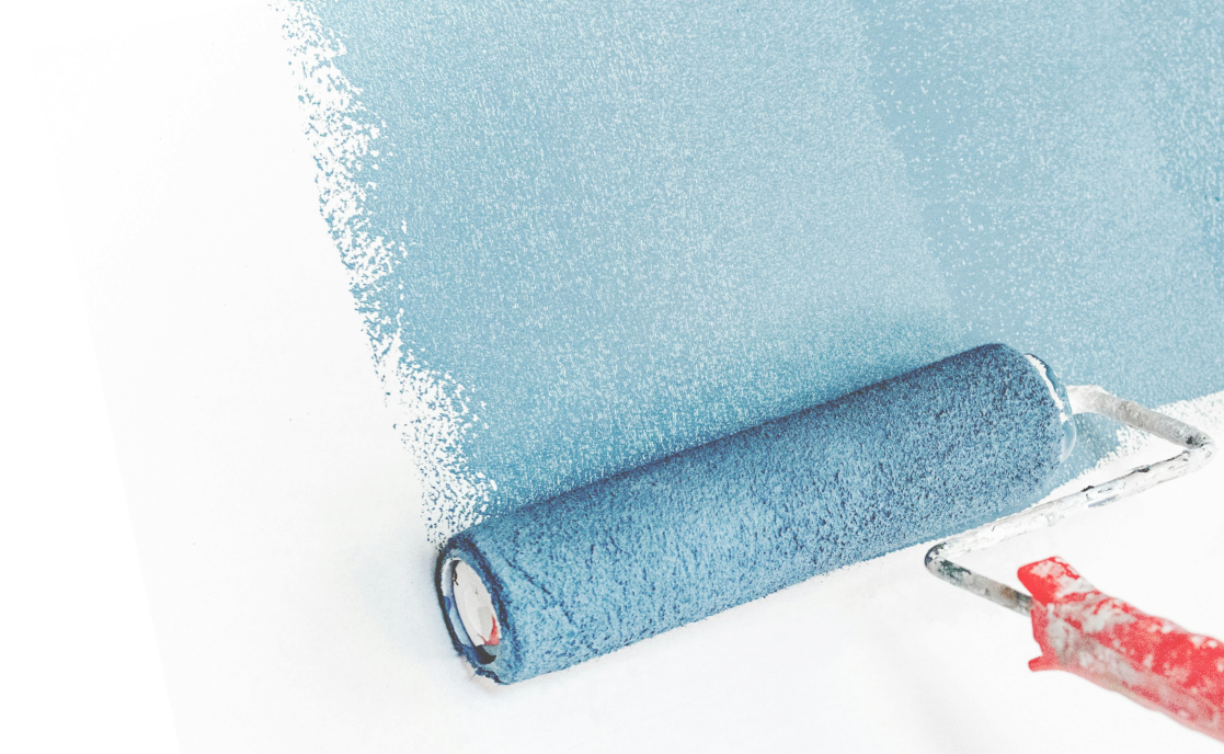
Two-Tone Pastels. Pastel colours are soft and inviting. A muted pastel colour paired with white creates a clean, trendy appearance. When used in a two-tone scheme, these shades will add a fresh and uplifting vibe to your home’s exterior. Pastel combinations, such as a pale blue against crisp white trim, can line architectural details and provide a charming contrast.
This approach adds character and allows homeowners to express their bright personalities while maintaining a sophisticated aesthetic.
Warm Earth Tones. An earthy palette with browns, beiges, and tans goes well with building materials like stone and brick. You can use the landscape surrounding your home as inspiration for what colours to choose. Warm earth tones create a cosy atmosphere and help your home blend harmoniously with nature. Different shades will create depth, enhancing the features of your house while staying cohesive.
Earth tones and nature-inspired colours are wonderful choices for any kind of property, regardless of setting.
How To Choose Your Exterior House Painting Colours
Keep these qualities in mind when selecting your home’s colour palette:
- Mood. Colours can convey different moods and will impact the atmosphere of your home. Bold, vibrant colours feel energising, whereas less saturated shades feel calming. Determine the mood you’d like to go for before choosing your colours.
- Surroundings. Think about the overall aesthetic you want to achieve with your paint colours and how it will blend with the natural landscape. Take into account the architectural style of your home to ensure a cohesive look with the surrounding environment. Consider the greenery, structures and environment surrounding your property.
- Fixed Features. Look at the colours of your roof, driveway, joinery and brickwork. These colours are generally difficult to change, so you should pick an exterior house palette that goes well with them. A cohesive colour scheme can greatly boost your property’s curb appeal and value.
- Personal Preferences. Aside from classic house colours and recommended palettes, search for colours that you like. Ultimately, your choice should suit your preferences. Don’t hesitate to experiment with combinations until you find the perfect fit for your home.
If you are struggling to make a decision, then we at Northland Painters can help. We can set up a meeting with a professional colour consultants at no extra cost. They can give you their expert opinion based on the above qualities so you can make an informed, confident decision.
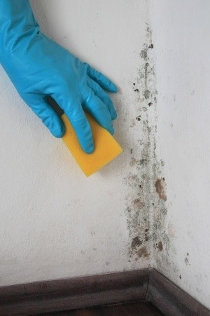
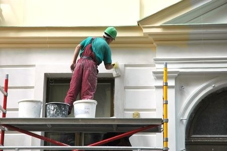
Reliable Exterior House Painting Services In New Zealand
Please visit our Northland Painters website to learn more about our house painting services. We are available for both residential and commercial painting projects.
You can reach us on 09 433 6187 or use our website to send us a message. We will be happy to answer any questions you have or provide you with a free quote.
Find the right colours for your house with Northland Painters.