Given the brain’s involvement in your perception of colour, it is perhaps not a surprise to hear that the colours around you can have a dramatic impact on your state of mind. How many of us have had the experience of sitting in a room surrounded by walls painted in a colour we consider intrusive, and felt like it was slowly inducing a headache?
Most of us are fortunately able to control the colours we surround ourselves with the most, by painting the walls of our home in shades that bring us pleasure. But how do we work out what colours are best?
It’s a personal thing
Everybody has individual tastes when it comes to colour, and what is pleasing to one person’s eye may be a big turn off for someone else. It’s all well and good to say that blue is a relaxing colour, for example, but if it isn’t to your personal taste then you probably won’t feel very relaxed waking up in a blue bedroom! So while colour psychology is worth considering, don’t forget to take your own sense of style into account.
What paint colours work best together?
Have you ever looked at two colours together – even if they are both colours you really like – and think, “That just looks so wrong”? It can be very uncomfortable to look at mismatched colours, especially if they are a permanent feature, so when selecting your paint colour scheme it is important to consider which colours will complement one another.
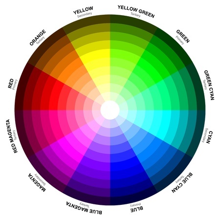
The best way to do this is by looking at the colour wheel. This is a circle based on the three primary colours – that is red, yellow and blue – with a graduation of hues that fade into one another. The most complementary colours are opposite one another on the colour wheel, for example yellow-green and violet, indigo and light orange or red and blue are all complementary combinations. These combinations are used in Colour Therapy, as the balance of cool and warm colours is said to improve our physical and emotional wellbeing.
If high contrast combinations are not your thing, you might want to consider basing your colour scheme on analogous colours. These are any three colours that sit side by side on the colour wheel, often with one colour dominating. Other popular idea is basing your colour scheme on combinations found in nature, which is another way of bringing colour harmony into your home.
The psychology of colour
The use of colour to promote healing and wellbeing has roots stretching far back into history, and to this day many people and cultures believe certain colours possess specific qualities that can have positive or negative impacts upon our lives.
Although modern psychologists are largely sceptical about the significance of colour in therapy, there are some effects of colour that are universally accepted. Reds, pinks, oranges and yellows are warm colours, and can evoke emotions ranging from passion to anger. On the other side of the spectrum are the cool colours, ranging from indigo to yellow-green, which are said to be calming but can leave a person feeling cold.
In a busy room or a part of the home you spend a lot of time, you might want to consider choosing a colour scheme consisting of greens or blues, which are considered to possess relaxation-inducing qualities.
On the other hand, purples are said to be best for creativity, due to the balance of stimulating reds and peaceful blues, so these colours are ideal in the study, office or perhaps an artist’s workshop.
Be careful when it comes to colours like orange and yellow. These are hardest on the eyes and can tire out your retinas, leading to feelings of frustration and irritation, so perhaps not the ones to paint your living room in from ceiling to floor. As an accent colour, however, yellow is considered one of the most cheerful and uplifting, so there’s no need to avoid that yellow lampshade you’ve got your heart set on just yet!


